Back to the Brand
Founded in 1597, the family business has developed into a globally active group. In 2020, the decision was made to reunite the plethora of subbrands and subsidiaries that had arisen under one brand.
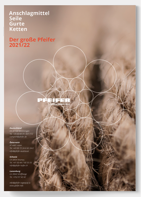
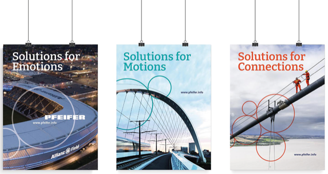
The rope as the core product of PFEIFER provided the basic idea for the new corporate design: Just as the various strands in a rope come together to form a powerful unit, all the subsidiaries combine with their strengths to create the big whole. The visual starting point was a rope cross-section, which was formally dissolved and reassembled. The brand stands in the new center.
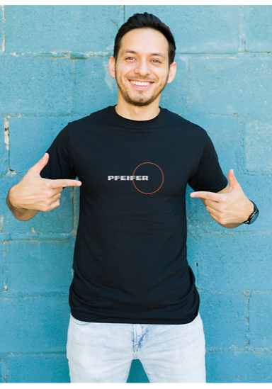
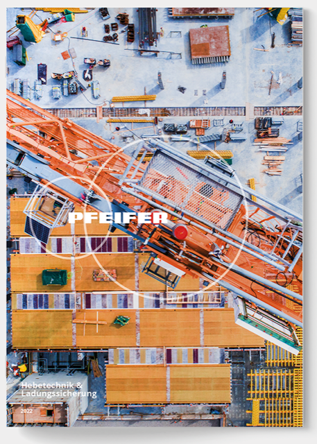
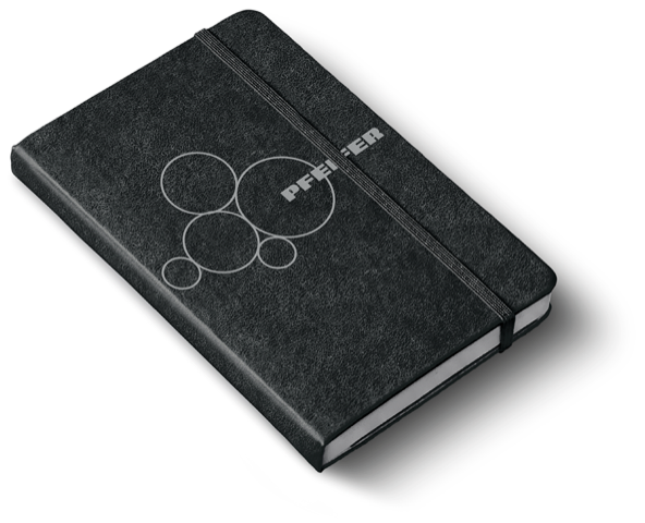
The company's new corporate design combines the familiar with the new. The PFEIFER logo, the corporate color blue, and the clear typography are enhanced by new elements. The circle plays an important role. As a cross-section of a rope, the circle represents origin and history. Symbolizing "unity", it signifies the future.
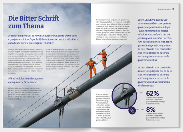
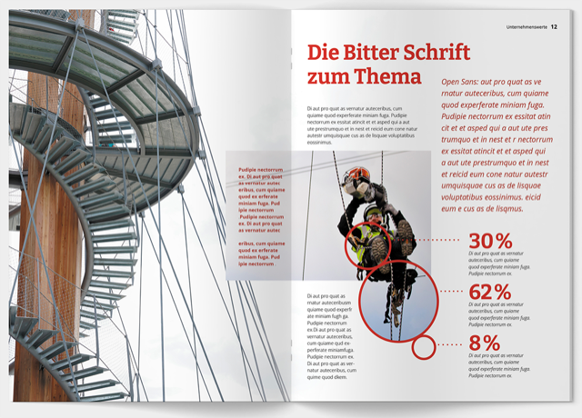
At PFEIFER, corporate blue is more than a legacy - it's part of its identity. The new design still proudly features the classic blue hues alongside other vibrant shades that evoke themes from both product and technology; Silver / Wire and Nature / Sisal are reminiscent of the product world. Technology / Steel Blue and Partnership / Award recognizes commitment to excellence in innovation.
Six secondary colors with shading complement the design options. Overall, the color palette is extensive enough to cover various applications, including complex graphics or diagrams
PowerPoint-Master und Chartpool.
